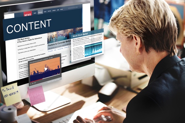
Ever spent hours designing the perfect social media post… only to see it look blurry, get cropped awkwardly, or—worse—not perform at all?
You’re not alone.
In today’s fast-moving digital world, social media image dimensions are the unsung heroes of content performance. They affect everything—from how your visuals appear on different devices to whether users stop scrolling long enough to engage.
Whether you’re a startup trying to stand out, a marketer pushing a new campaign, or a content creator building your brand, getting your image sizes right matters more than ever.
Let’s walk through exactly why—and how—you can level up your visuals this year.
Did you know that using incorrect image sizes can reduce engagement by up to 20%? That’s right. If your visuals are stretched, pixelated, or cropped in weird places, users are more likely to scroll past.
And that means wasted effort.
Think about the last brand you followed. Was their content clean and consistent, or messy and mismatched? Sharper, properly formatted visuals create a polished look, and that builds credibility with your audience.
More than 70% of social media browsing happens on phones. That means your visuals have to fit a small screen perfectly. The wrong size? That could mean chopped-off headlines or distorted images, and no one wants that.
Here are the ideal dimensions for each major platform. We’ve included aspect ratios, recommended resolution, and key specs for planning.
| Platform | Image Type | Size (px) | Ratio | Pro Tip |
| Shared Post | 1200×630 | 1.91:1 | Scales cleanly in feed and link previews | |
| Cover Photo | 820×312 | ~2.63:1 | Visible on both desktop and mobile | |
| Square Post | 1080×1080 | 1:1 | The classic IG format | |
| Portrait Post | 1080×1350 | 4:5 | Covers more screen = better reach | |
| Story/Reel Cover | 1080×1920 | 9:16 | Full-screen immersive feel | |
| Twitter (X) | Tweet Image | 1600×900 | 16:9 | Looks sharp in feed |
| Twitter (X) | Profile Header | 1500×500 | 3:1 | Sets the tone for your page |
| Shared Image | 1200×627 | 1.91:1 | Great for content and blog shares | |
| Company Banner | 1128×191 | ~5.9:1 | Professional presence starts here | |
| Pin Image | 1000×1500 | 2:3 | Tall images win visibility here | |
| YouTube | Video Thumbnail | 1280×720 | 16:9 | 90% of top videos use this size |
| YouTube | Channel Art | 2560×1440 | 16:9 | Mind the “safe zone” for cross-device fit |
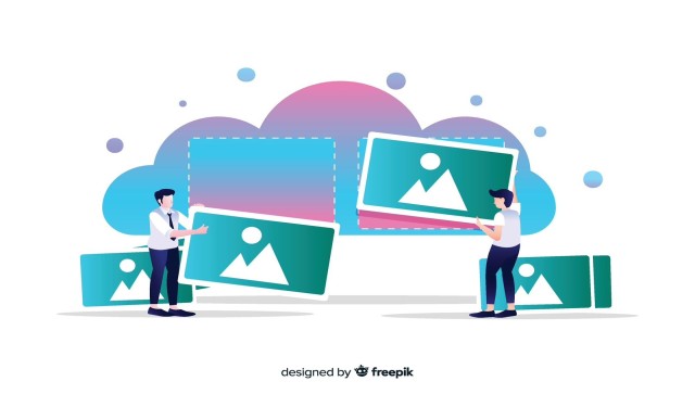
Start with a high-res base file (like 1920×1080), then reformat versions for each platform. Use tools like Canva or Photoshop’s crop presets to make resizing stress-free.
Cropping without checking ratios is like cutting a photo with your eyes closed. Keep main elements—like text or faces—centered, and use safe zones to avoid awkward cuts.
72 DPI is perfect for screen use, but make sure your images are crisp. Upscaling low-quality images often leads to blur, so always design at or above the target size.
No one likes slow-loading content. Use free tools like TinyPNG or ShortPixel to keep image files under 200 KB, which helps speed things up without ruining quality.
Text overlays like quotes or CTAs boost attention—but don’t go overboard. Keep it short, contrast it well, and place it within safe areas.
Whether it’s a filter, font, or color palette—consistency builds recognition. The more uniform your visuals look, the easier it is for followers to associate them with your brand.
A/B testing isn’t just for ads. Try posting two versions of an image—different crops, colors, or layouts—and track which one drives more clicks or shares.
Check public platform guidelines regularly—things change every few months.
Use platform analytics to track reach, clicks, and time-spent-per-post. See if a dimension change affects performance.
Post formats matter. Teasers? Use portrait crops. Thought leadership? Try widescreen shared images.
Even with the right dimensions, issues can still pop up, like blurry visuals or awkward cropping. Here’s a quick troubleshooting guide to help you spot and solve the most common image problems before they affect your brand’s visibility.
| Problem | Cause | Solution |
| Image blurred in post | Low resolution or wrong size | Use the exact pixel dimensions above, no upscaling |
| Key visuals cropped | Not using safe zones | Keep faces/text centered, use guides |
| The file is too big, slow to load | No compression | Save as web‑optimized (JPEG/PNG), use compression tools |
| Colors appear faded | Wrong color profile | Export using standard sRGB |
| Aspect ratio mismatch | Wrong canvas size or cropping | Double-check the ratio before export |
If you've ever spent hours designing a post only to see it look pixelated, awkwardly cropped, or completely ignored, you're not alone. It’s frustrating when your visuals don’t match your brand’s quality or your audience’s expectations.
That’s exactly why We Love Digital Marketing exists. As a creative-first social media marketing company, we turn visual chaos into content clarity. Whether you're a growing brand or an established business, our expert team, backed by one of the most trusted social media companies in Toronto, knows how to make every image count, on every platform, every time. Let’s turn your feed into a visual story that connects, converts, and inspires.